How often do you find yourself leaving a website half way through your shopping experience simply because the way the site functions irritates you? Perhaps it’s a really long checkout process, or perhaps it’s a site that doesn’t let you view 200 products per page? Either way, the company has ticked you off and the though of handing money over to them is less than appealing!
Thanks to many awful online shopping experiences, I’ve become a professional at ABANDONING shopping carts. I do it so often that I begin to wonder how many other people are doing it too. While the literature says it’s quite a few, I decided to put the question to my own family. I learned that my parents and my sisters all do the exact same thing. In fact, my younger sister has taken it a step further. She tells me that rather than buying something, if the website makes the whole process really difficult (and if they don’t save her credit card information like Amazon does), she’ll ‘pin’ the item she wants on one of her Pinterest boards and then search for it elsewhere (usually on Amazon or Ebay). Recently she even told me that when she ‘pins’ something she feels as though she’s bought it. This means that half the time she doesn’t even bother to make the purchase! Her own experience, coupled with mine and my family’s, leads me to believe that many ecommerce companies do not know how to operate a good, user-friendly website. Whether this is thanks to a poor digital agency or bad decisions made on behalf of the company itself, I don’t know. Either way, I believe it’s important for site owners and company owners/managers to know the attributes of a good ecommerce website.
So, without further ado..
A good ecommerce website is: EASY TO NAVIGATE
That is, ‘easy to move around within’. How easy do you make it for your customers to get from one place to the next? How easy is it to go back, to find a coupon, to use your site search, to apply filters to product pages? How easy is it to move from shopping to checkout to your own account settings?
And, when it comes to mobile devices, how easy is it to navigate your site on a mobile? Increasingly this is how people are choosing to shop. If you have a huge mega menu on your website, does this easily adapt to work on a phone? If not, how are you accounting for that?
Take a look at the John Lewis website. I particularly like how they’ve handled multiple menus – one at the top for ‘account’ information, one below that for other important links. And then of course, the one below that containing the links to the products. It’s all just dead simple meaning, you don’t have to spend 2 minutes figuring out how to get back to a category page or how to find the ‘gift list’ or even how to access your account.

When you look at the site on a smartphone, you’ll notice that John Lewis has pared back on offers, just keeping the slideshow. The crux of the mobile site is the menu. This allows you to rapidly get to the category you want. And, if you’d prefer to use the ‘search’ function, well that’s still there too. The small ‘breadcrumb’ back buttons also allow you to go back to the previous page in a single step. Some lovely, really simple touches on this site which just goes to show that design for aesthetics is not everything while design for a great user experience may just be.
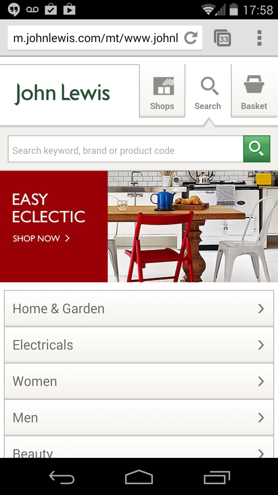
Take home: make it easy for your users to get to category pages, to get back to the homepage, to get to product pages, their personal account, shopping cart, wishlist, etc. They shouldn’t have to spend too much time thinking. And, if you’re going for a mobile website, don’t think you have to show everything. In mobile mode, people are thinking differently. Most of the time they’d prefer the pared back version of your site.
A good ecommerce website is: EASY TO SHARE
For me, this advice has been dispensed ad nauseum. I’ve done it, other marketers recommend it and still… some companies don’t get it!
Social Sharing icons should appear on every page of your website (ideally in the header/footer where people expect to find them). They should also appear on every single product landing page, on every single blog post and in your blog feed if possible.
If you’re serious about growing your social following and building a community about your brand, you may also want to consider social banners that advertise campaigns you’re running, and consider integrating a ‘feed’ or a couple of feeds into your website.
Take a look at Fossil’s website. They’ve done everything we advise and it makes life a pleasure, especially because I’m frequently sharing their products with friends that are looking for gifts for fathers or boyfriends. Note how they’ve also taken care to pick the social networks that matter – for them it’s Facebook, Twitter and Pinterest. This personalisation gives the site that extra special touch.
Note the Twitter feed on the left-hand side of the page; a link to their Instagram feed, and social icons on the blog archive page. They’ve also got them in the posts.
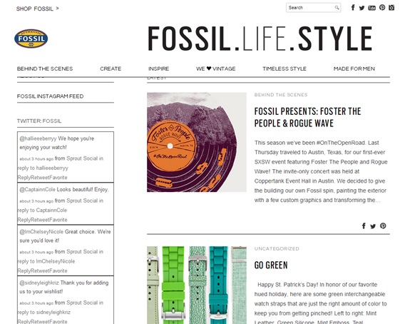
Their homepage has links to their social platforms and their blog in the footer.

And, each product landing page has social sharing links to Facebook, Pinterest, Twitter and a ‘share by email’ option. This share by email option is another nice touch, especially when you consider you may want to send a product link to someone without a social account. For Fossil’s audience – perhaps an older, wealthier audience, Pinterest and Twitter may not cut it.
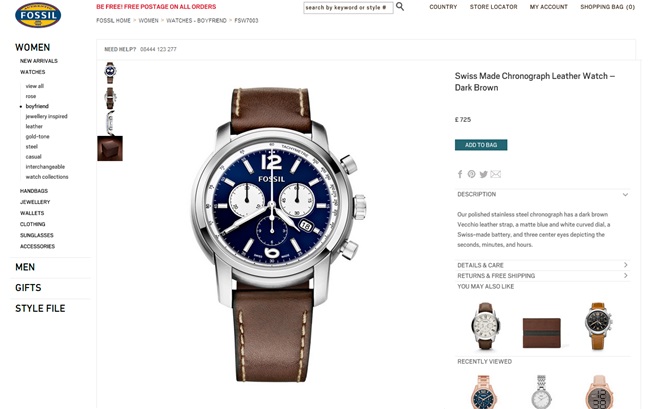
Have a look at Fossil’s ‘Style File’ while you’re at it. Scroll down the page and you’ll find a link to their Lookbook, their ‘Tin it to Win it’ social campaign and their blog. These links all prompt users to interact with them in the manner they prefer. They also help to promote what the company is doing outside of simply selling products.

Take home: include sharing icons wherever possible and don’t forget to tailor them to your audience instead of dumping the kitchen sink onto your site. Also, promote your campaigns and, if you think it will drive interest or if you’ve got particularly interesting content on any of the social platforms attached to your business, feed them into your website!
A good ecommerce website is: A SITE YOU FEEL YOU CAN TRUST
We don’t just mean you should be able to trust the site with your credit card, but that the site should incorporate features such as product reviews, primarily because they give users a sense that this is a company others buy from. A few negative reviews don’t go amiss either! When reviews are all positive, I often find myself wondering if the company has reviewed their own product or if they’ve paid someone to do it. A bit of negative feedback means that the company has ‘opened’ themselves to the public.
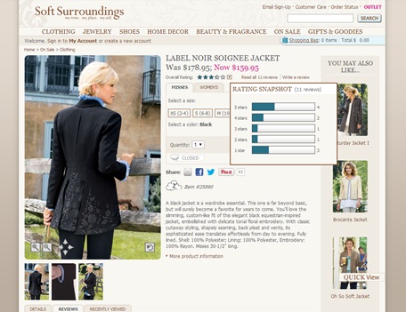
US-based Soft Surroundings puts quite a bit of emphasis on their product reviews. Rather than having to switch a ‘tab’ to read the reviews as you do in many other sites, these reviews are already the focus of the page, not dissimilar to Amazon’s product pages. And best of all, there’s a nice smattering of negative feedback meaning that these are REAL customers buying the products. This means I tend to give the reviews more credit.
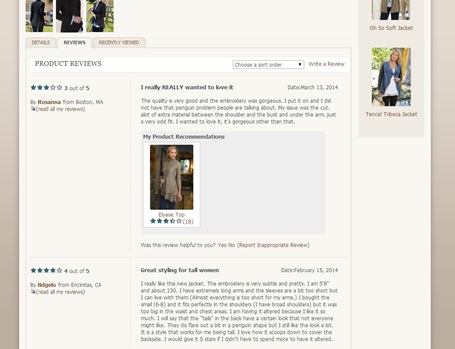
I also love the drop-down button next to the rating which allows me to see how many good and bad reviews there are.
When it comes to including trust logos on your site, you can do so in the footer or in the shopping cart. Take a look at Argos’ cart page and you’ll see that they’ve included information to reassure purchasers that this is a safe site to buy from.
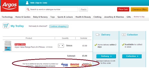
Take home: don’t be afraid of receiving a few negative reviews. These could actually make your company appear more trustworthy. When it comes to checking out, be sure to use logos/relevant wording in order to reassure your customers that their card details are in safe hands.
A good ecommerce website is: CLEVER WITH COUPONS
When it comes to handing out coupons, I cannot think of a smarter company than Michaels. This US craft store is savvy with their ‘deals’. They don’t leave you to search Google for coupon codes that others may have posted – instead they hand them to you. They keep you on the site and they keep you coming back to check in all the time. They get it perhaps better than any other company I’ve come across and even though their coupon marketing is ‘in your face’ I don’t mind it because it’s helpful!
Sign up for their mailing list and you’ll receive regular emails that contain coupons and information regarding in-store sales. Plus, if you try to redeem your coupon, they’ll give you the option of printing it off or having it sent to your phone. They even offer ‘coupons on the go’. The best part? You don’t have to look for hard. Their homepage has a huge 40% off coupon right below the main slider.
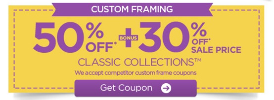

Time and time again I’ve chosen to order from this site rather than their competitors and mainly because I feel they’re ‘giving’ me something.

If you’re feeling adventurous, flip your location to ‘Michaels Canada’. You’ll see the navigation changes. Now there’s a ‘weekly ad’ link that takes you to a page with more great coupon codes and offers.

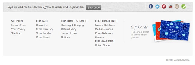
Wait! It doesn’t stop there. Yup, this company is crazy! Scroll down to the footer and what do you see? A call-to-action prompting users to subscribe to their mailing list to receive special offers, coupons and inspiration.
Now click through to a product page. I’ve randomly picked a ribbon. Right at the top of the screen I’m presented with yet another coupon code.
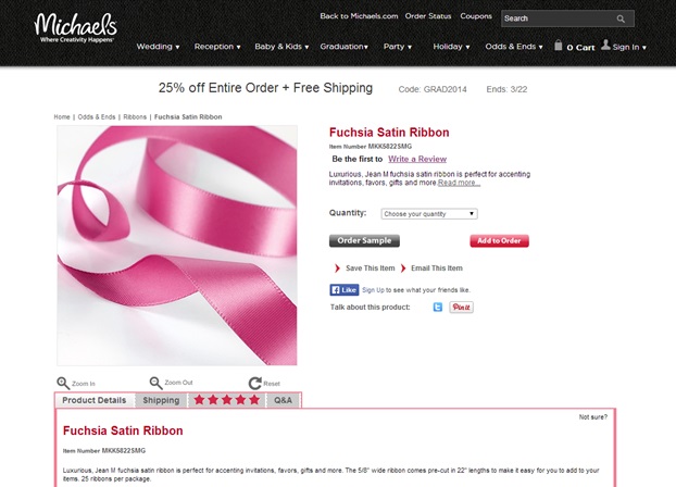
Take home: if you’re going to offer coupons, do it properly. If you’re not advertising your coupons well enough but are including a space to enter a coupon code in the checkout section, you may be doing more harm than good. In fact, you’ll likely find users abandoning their shopping carts to hunt down coupon codes in Google. And, when they don’t find them? You can bet they won’t feel so much love for your company.
A good ecommerce website is: FAST
Okay, so site speed matters. Seriously. In an ideal world your site would load instantly and your shoppers would happily hop from page to page. The reality is that most sites take longer to load. According to Jakob Nielsen, people can handle waiting up to 10 seconds for a website to load. Longer than that and they begin thinking about other things or worse, they leave your site entirely.
In 2009, Forrestor Consulting conducted an ecommerce website performance speed study on behalf of Akamai Technologies. They found that on average, shoppers expect a page to load in 2 seconds. Their other findings are just as startling:
- 47% of consumers will wait no longer than 3 seconds for a retail or travel site to load before abandoning it.
- If a shopper has to wait a long time for a site to load, they become distracted. 14% will begin shopping elsewhere and 23% will stop shopping entirely.
- Customer loyalty is also linked to site speed. 79% of shoppers who experience a poor visit are less likely to buy from the site again. 64% will purchase form another online store.
- 1/3 of consumers report wanting to shop via their smart-phones.
This study took place in 2009. Can you imagine what the statistics are today? Each year companies will be expected to have faster loading websites and more mobile-friendly websites.
If you want to increase your site speed, here are a few simple fixes:
- First use a tool to figure out what your Site Speed actually is. There are plenty of free tools online. You can try Google PageSpeed Insights or Yahoo! YSlow or even Webpage Test.
- Optimise your images – reduce file sizes, including images in blog posts, in slideshows, on the homepage, etc. Kraken is a great tool that can do it for you.
- Make sure you’re using a fast web host. If you’re using Bluehost, GoDaddy or another large, low budget hosting company, you’re compromising on speed.
- Reduce your redirects as these increase site load time.
- If you’re using WordPress, even if it’s just for a blog, reduce the number of plugins you use. These slow your site down and create potential security risks.
- For a few more professional tips take a look at this post. You may need your website developer on hand.
Take home: don’t settle for a site that takes more than 10 seconds to load. Ideally yours will load within 3. If it doesn’t, take the necessary steps to try and decrease page loading time.
What else makes for a great ecommerce website?
We’ve not even mentioned half of the things that contribute to a great site. A few more include:
- A user-friendly checkout including the option to checkout as a guest and to store card details
- Great product photos and multiple product photos
- Upfront pricing
- Additional options at checkout – giftwrapping, messages, etc
- Related items or popular items on individual product pages
- Readily available contact information – live chat, telephone numbers, contact forms or email addresses
We’d like to hear your stories. If you’ve had any frustrations with sites or come across a really great site, please do share with us.


