Responsive web design is easily the best option for businesses ready to get started with a mobile web design, as it boasts a number of key benefits over other alternatives. But what makes a responsive web design a first-rate experience?
Having a mobile website is more important than ever, as mobile internet users have officially overtaken those using desktop devices. Also, having a mobile or responsive web design will now get you an SEO boost due to Google’s new mobile-friendliness ranking factor.
All in all, you can no longer afford to shun your mobile visitors by providing a second-rate experience. If they don’t get the usability and functionality that a responsive web design provides, then they are very likely to go elsewhere.
Opting for a responsive web design is the best option when weighing up the options for a new mobile web design; but where do you go from here? What do you want to get out of a mobile web design, and how can a responsive website help your business generate more revenue, and ultimately grow online?
Below we have listed some great examples of responsive web design from around the web, and assessed certain elements that make the mobile web design involved so great.
EE – ee.co.uk
EE are the largest digital communications provider in Britain, and so it makes sense they have a website to go along with this. Of course, a responsive web design was the way forward.
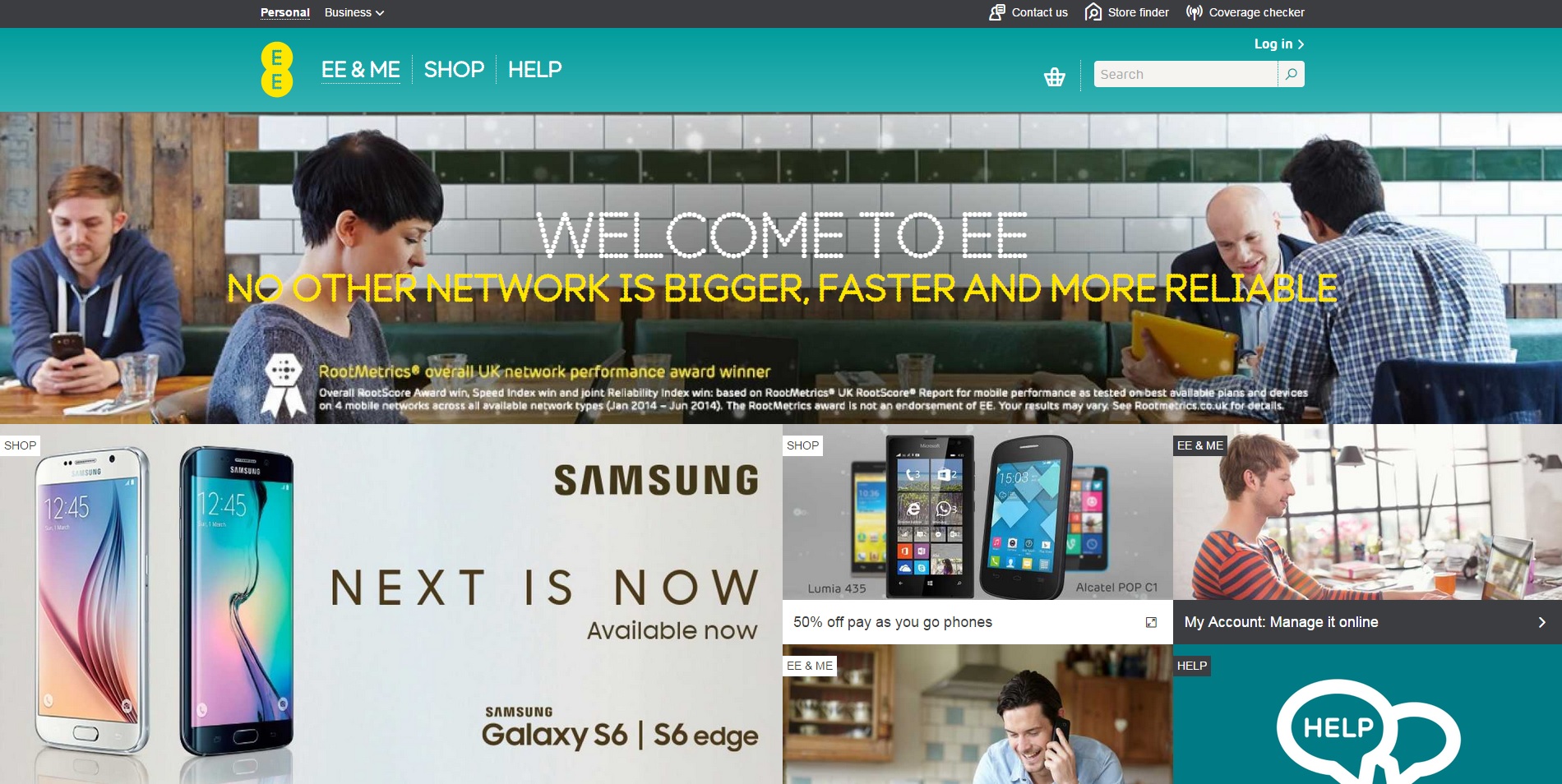
The responsive web design makes sense for a company who sell mobile phones and the data to access the internet on-the-move; allowing top functionality and accessibility to both existing and potential customers.
The website echoes their unique branding and colour scheme throughout, with the mobile version of the site reducing the main images displayed on desktop to an intuitive image slider.
But the website isn’t all looks, and packs in some pretty decent features that work on mobile devices. This includes a distributor locator, a coverage checker, and video integration. This is great and unique functionality for customers to find what they want, with everything remaining to the point and easy to navigate to.

BBC News – bbc.co.uk/news
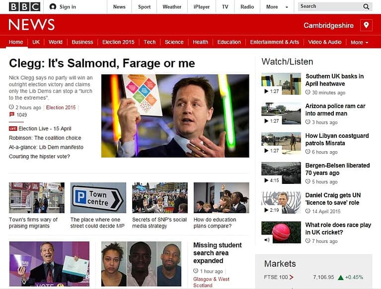
BBC News underwent a new web design recently, opting for a fully responsive web design that allows visitors to browse the news on whichever device they desire.

The BBC has a very distinct and recognisable brand image, and this responsive web design manages to keep this consistent on whichever device you may be viewing the website on.
The responsive design also manages to select the most important information and articles as it shrinks down; dropping the side menus and other areas in order to focus mobile users on the main headlines and news articles. This is important, due to the fact that mobile users will spend less time browsing the website, and want to get relevant content as quickly as possible.
Responsive web design is great from a content marketing standing; as if any pieces of content are shared by either desktop or mobile users, the URL will be the same no matter what. This means if someone shares a piece of content on their desktop, and their friend opens it on a mobile, it will still be completely optimised for their device.
Orangina – orangina.eu
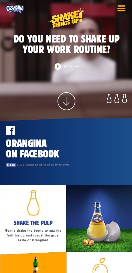
Orangina have managed to create a stunning yet simple website that is full of vibrant colours, and remains completely in-line with their products and branding along the way.

The custom iconography is a nice touch, allowing you to switch between slides by hitting the bottle icons; which additionally fill up as they are automatically timed to slide across.
Orangina also use straight forward and precise wording, with exactly the right amount in the right places; ensuring that visitors aren’t overwhelmed by unnecessary wording.
When it shrinks down to a mobile device, the website makes great use of tiles for easy finger-clicking. Facebook is also clearly visible, and remains an important part of the website design as a whole.
Throughout the entire website, Orangina also manage to promote their “Shake Things Up!” campaign; whether it’s through images, logos, videos, or otherwise. This consistent and clever branding keeps the brand in your mind long after you’ve left the website.
Grey Goose – greygoose.com
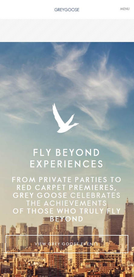
Grey Goose maintains its reputation for high quality alcohol through a top responsive web design. The mobile design looks great, allowing quick links to where you want to go, whilst making use of high quality images to represent the brand.
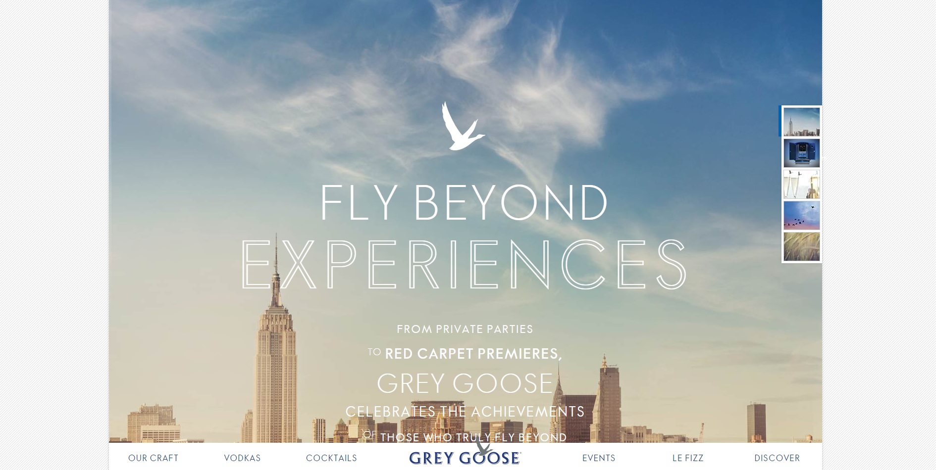
Whilst parallax design isn’t the best fit for most purposes, it works very well for Grey Goose in getting across their brand image through a series of elegant images that create a seamless and inspiring browsing experience.
The design makes great use of ghost buttons (highlighted in our web design trends for 2015 blog post), to maintain a minimalistic feel that is displayed on the bottles of their own products.
Overall the website provides a top-rate experience for what is considered a top-rate product, and manages to convey what sets their product apart from the competition.
Skinny Ties – skinnyties.com
Skinny Ties have managed to create a website with a distinct design, and one that fits perfectly on whatever device it is viewed on.

What I really like about this design, is just how well the business and product line of ties fits in with mobile web design; as the concept of ties is great for vertical viewing on mobile devices which are usually held that way.
Otherwise, the design is stylish to reflect the ties and other accessories on offer, whilst maintaining a speedy experience that loads quickly, to ensure customers can quickly browse the products they desire.
Paperchase – paperchase.co.uk
Paperchase provide a huge range of quirky and interesting stationary and giftware, and their website provides a design-driven shopping experience which appeals to key demographics.
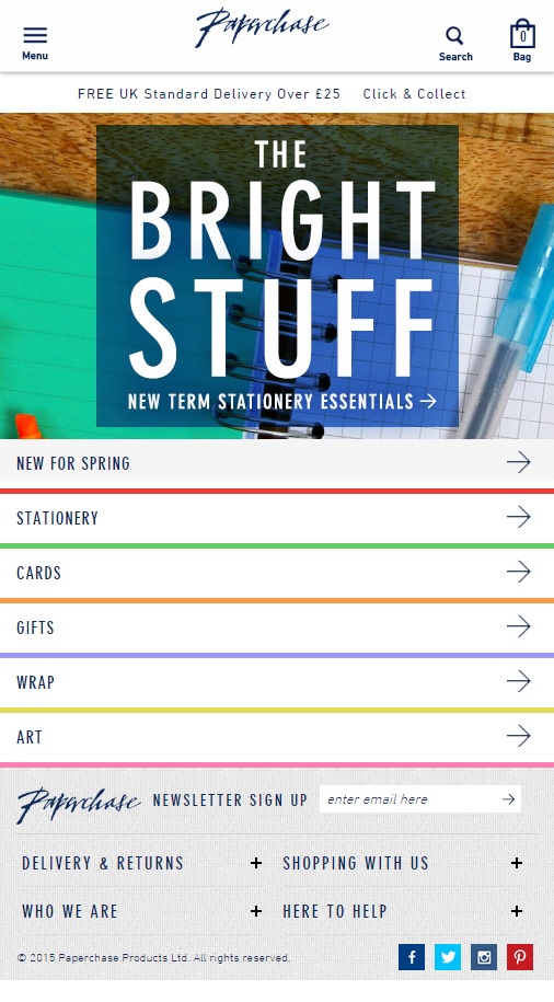
Paperchase has a unique and memorable brand that is echoed through their retail stores and online; and the website manages to keep this in mind, whether it’s through the navigation or imagery used. The main imagery, and even the menu underneath, keep a craft-like feel throughout the shop, which is full of colour and unique products that the brand are known for.
Social media icons at the bottom include both Instagram and Pinterest; which are great places for Paperchase to display what they have to offer, and cultivate a following that will enjoy sharing and viewing the stylish products.
They also provide an easy opt-in form for their newsletter, whilst also providing all necessary information for any questions customers may have at the bottom. Stating the delivery pricing and click and collect options at the top is also a great move to entice shoppers.
Rock En Seine – rockenseine.com/en
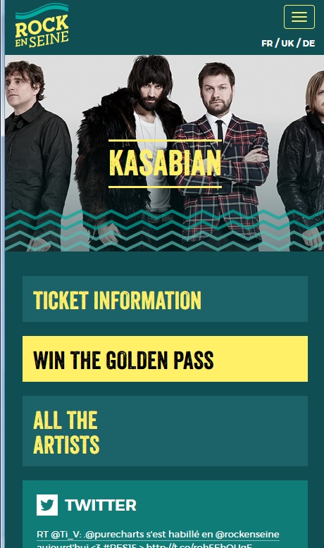
Rock En Seine is a French music festival that combines a very stylish design with great accessibility and clear menu navigation.

The desktop site displays striking imagery with a great way to display the line-up for different days, through a range of different images that will respond directly to the size of the device or browser in question. All relevant links are displayed at the top, and it also has relevant social media icons on display clearly.
The mobile website allows quick access to the menu through a hamburger menu icon, with the addition of a language selector; which is a very important for an event which attracts people from around Europe. Young music fans are also more likely to be viewing the website on their mobile devices, and so a responsive web design is a great fit for what is undoubtedly the core audience for music festivals.
The mobile website doesn’t sacrifice design or functionality, and still echoes the same great branding and colour scheme that makes the main website so memorable.
The AA – theaa.com
AA have created a responsive web design that looks great on mobile devices, and allows instant access to all the sections that people might be looking for.
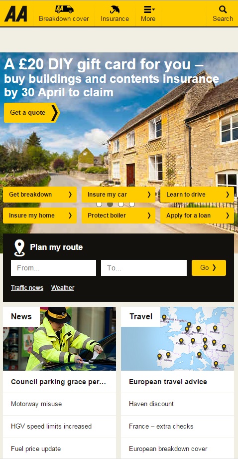
The opening image slider conveys what the AA do, whilst providing quick links to the most important parts of the website. This will get visitors to where they wish to go straight away.
Alongside this, the route planner is a nice addition to the home page, encouraging on-the-go mobile browsers to quickly begin planning their journeys. Involving travel advice and relevant news is a nice touch, and is easily viewed on a mobile device.
Sta-Lok – https://www.stalok.com
One of our own responsive websites, Xanthos created a responsive web design that allows great navigation and usability across a range of devices.
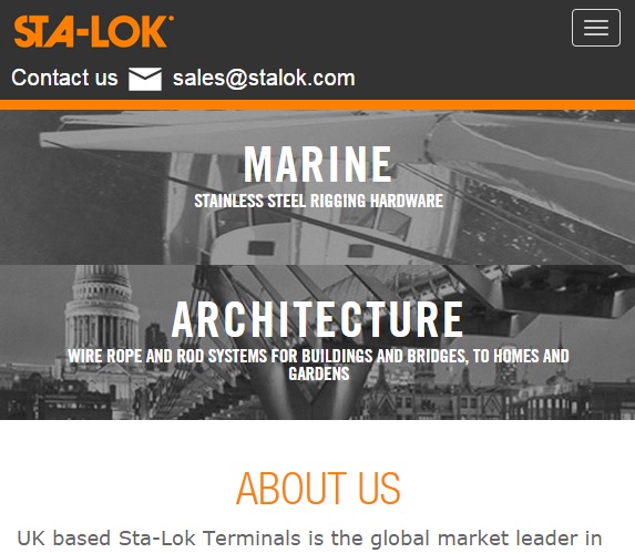
Sta-Lok had experienced a huge rise in mobile visitors, and so going responsive was deemed a necessary evolution for the website.
The home page gives a great sense of what the brand offers, whilst allowing easy navigation via an attractive entry point for both marine and architectural industries. The website was built on the latest version of AspDotNetStoreFront, with an all-new responsive blog, and a dealer locator area in order for visitors to find their closest dealer through Google Maps.
For more inspiration, view our other blog posts below:
Responsive Web Design Examples for Ecommerce
Top Manufacturing Website Designs for Inspiration
Top Travel Industry Website Designs and Features of 2014
If you’re looking to create a mobile or responsive website for your business, get in touch with the team at Xanthos, who have over 12 years’ experience in helping brands grow online.


