There’s a lot that goes into designing an ecommerce website: from creating a website design that is aesthetically pleasing and that showcases the company’s key products, to ensuring it is search engine optimised; embodies the company ethos, and is easy to use.
Inspired by an article from DesignM.ag, I’ve compiled a list of points I think are important to keep in mind if you want a beautiful and functional ecommerce website. While each recommendation is my own, most of the website examples are taken from Brant Wilson’s post ‘38 Beautiful Ecommerce Websites’. Take a look at it if you simply want to browse through a few attractive ecommerce websites. Do bear in mind however that pretty does not mean functional.
In this post I will briefly detail some of the things I believe are important when it comes to creating an attractive and user-friendly website. I’ll expand on them in later posts, dedicating more time to each of the individual features.
Prominent and easy-to-use search function
If you’ve got a website with a lot of products, it may simply be easier for a user to find what they are looking for by using your site’s search feature. This is especially true if you have a wide range of products within one category. And, according to Smashing Magazine, an effective search feature can accelerate the sales process, ultimately increasing conversions.
Take a website like Argos.co.uk. Without the search feature, looking for something like a desk chair would be a nightmare. It would involve some intuitive guessing – do you look for the chair in the Home & Furniture department or do you look in the Office, PCs & Phones category? Assuming you do pick the right category, you’ve still got to browse through the long list of sub-categories on the left-hand side of the screen. If it’s this complicated, you can bet that some of your customers may just pick another site with a powerful search option (perhaps Amazon or IKEA).
A design that keeps the end-user’s persona in mind…and a homepage that tells you exactly what the site is about
Before anyone can design a website for you they have to know who your audience is – where they shop, what they eat for lunch, what makes them say ‘wow’, what makes them click. Well, it’s really more about what makes them click and buy but if you can create a real picture of them, that’ll really help.
Take a look at Gazel’s website. They’re a San Francisco based company that sells luxury organic bathroom accessories. And guess what, this is immediately apparent because the site has been designed in such a way that the fact they use ‘certified 100% organic Turkish cotton’ seriously sticks out, as do all the green highlights and hover effects. That their towels are luxurious is also immediately obvious. The site is clean, sparse and has touches of gold – nothing too garish, just flecks here and there. The navigation is also fluid and the products are beautifully packaged.
Ensure important content is easy to find
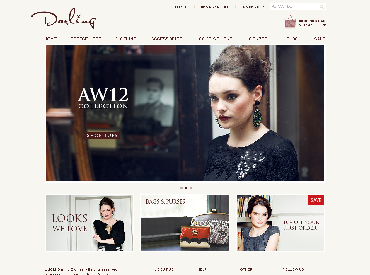
If you own an ecommerce clothing company it’s essential to make sure that the content your customers might look for on a regular basis is easy to access. On Darling Clothes’ website, the footer area is clean and simple and clearly displays some of the most important information: a link to their contact page, a careers section, the company’s size guide, their returns policy and their terms and conditions. They’ve also got an about us section, a few other links for non-buyers and links to their social media pages.
If there are a few pages you expect current and prospective customers will want to regularly visit, you may want to consider a similar approach. Deep footers like this are now widely used – on ecommerce websites, blogs and informational sites. For many people, it is now second-nature to scroll down to the bottom of the page.
Make sure you’ve got the content people expect to find in the places they expect to find it.
A clean and simple approach to design
Clutter is hardly ever appealing and when it comes to trying to make an online purchase, it’s the kind of thing that could make your user leave your website, especially if it makes it hard to find what you came looking for in the first place.
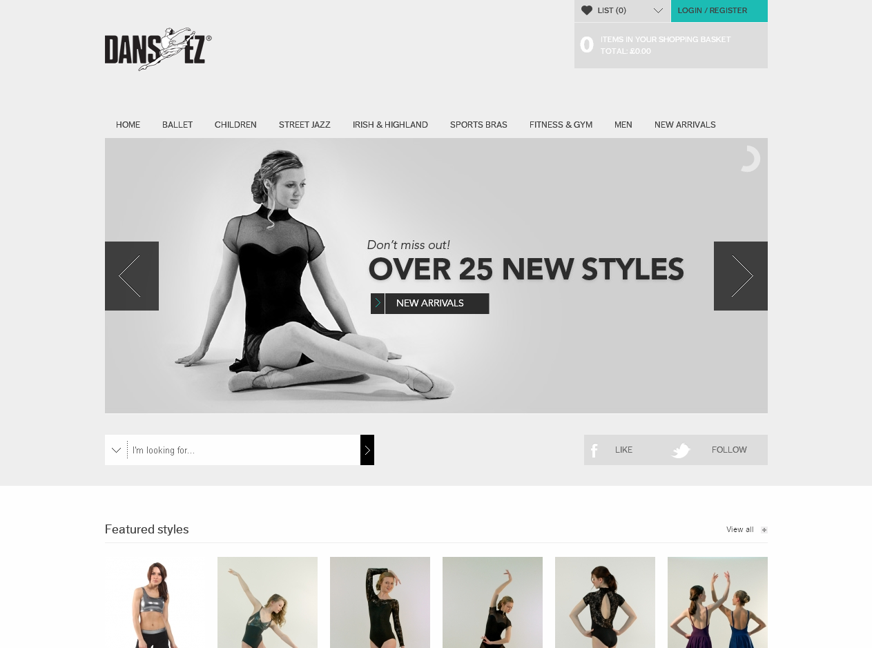
Take a look at the Dans-ez website and you’ll see what I mean. The design is so minimal it almost feels as though there’s no design. This is part of the site’s charm. It’s easy to focus on what you’re looking for and on the core messages displayed in the main slide show.
Click on any of the categories and you’ll find that each page is just as easy to use and navigate as the homepage. The left hand side navigation helps you browse through sub-categories and when you click on an individual product, the simplicity of the design carries right through – bold pictures, a size chart and the ability to choose the colours you want.
Fantastic product pictures
If you’re able to contract a good product photographer, do it. Great product pictures go miles toward helping sell your products. They’re also particularly important if you sell luxury goods, or products that are a cut above those your competitors offer.
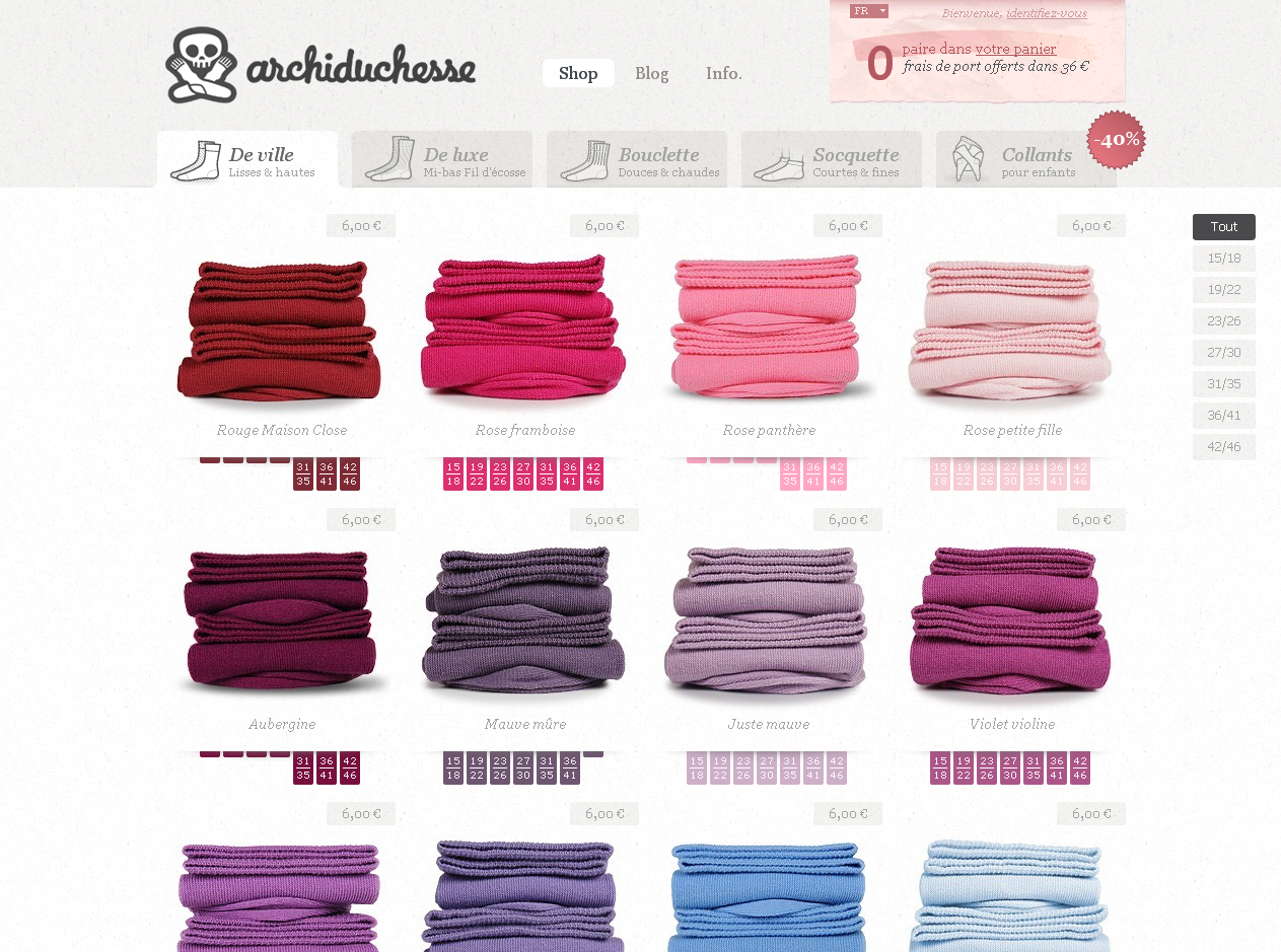
The French website Archiduchesse has leveraged this exact technique. As with Dans-Ez, they’ve gone for a very clean and simple layout – a perfect idea as the focus is entirely on the beautiful products and the wide range of coloured socks they sell.
Security and safe shopping
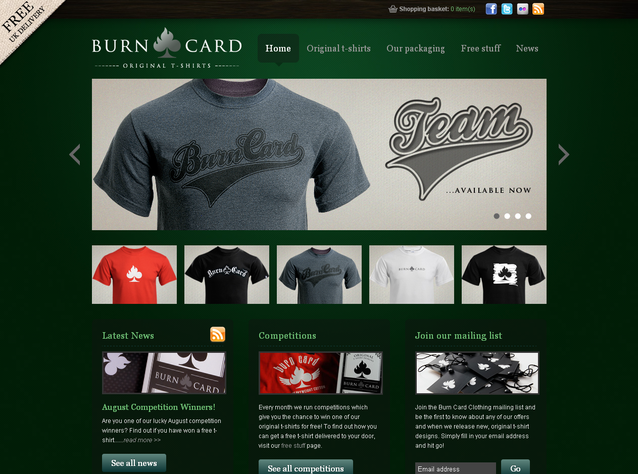
When consumers shop online they want to know their transactions are secure. Take a look at Burn Card Clothing Ltd. Scroll down to the bottom of their website and you’ll see there’s a section entitled ‘Shop safely with Burn Card’ as well as a small paragraph where they tell you that all their payments are processed using PayPal “the world’s most secure online payment provider”. Below that are the logos of the credit/debit cards they accept. Not only does this add to the professional and secure look of the site, but it also gives a customer immediate insight into how transactions will be processed.
Another way to show people that your payment process is secure is to do what this company has done:
Take a look at the logos in the footer. There’s PayPal, Sage Pay, that same list of credit/debit card logos and then a small padlock icon. The fact that this company uses secure payment providers like PayPal and SagePay adds to the shopper’s feeling of comfort when using and purchasing from the site. Also, note that in the ‘Help’ section there’s a tab entitled ‘Shopping Security’. That way, if people have further questions, they can go ahead and check out this section.
Fast load time
Ensuring you’ve got a website that loads quickly is important – that’s why features like Flash technology are not very inclusive. They slow page load time and are not compatible on all devices. Of course, if your target market is high end, perhaps you’re okay with that. Many luxury jewelers and car manufacturers have flash enabled websites as their target audience is very wealthy people who are likely to own devices/computers that will load the content quickly.
Established
An established looking website says to your customers/prospective clients ‘hey, I’ve been going a long time, I know what I’m doing, here’s what I can do for you’. It’s a look that many ecommerce websites aspire to, especially if the products are new or different.
Take a look at the website for Jenier World of Teas. One of the things that makes this company look so established is their apparently vast selection of teas and the additional knowledge they provide on their website which states where the teas come from.
Prominent shopping cart/shopping bag area
Just as Amazon’s shopping cart is prominently displayed, the same thing should apply to all ecommerce websites. The checkout process needs to be as smooth as possible for all your customers. According to website optimisation company Invesp, approximately 65.23% of shoppers abandon their shopping cart. They’ve got a great infographic here but I’ve summarized a few of the reasons given for why web buyers abandon their carts:
- High shipping costs
- Not ready to purchase
- High product price
- Wanted to save products for later consideration
- Did not clearly mention shipping costs
- No guest checkout option
- Need too much information
- Complex checkout process
- Website too slow
- Pay extra for taxes
- Do not have enough payment options
- Slow shipping
- Spam with offers
- Website crashed
Good filters if you’ve got a lot of stuff to choose from
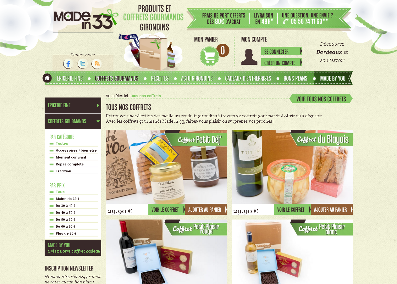
Filters are those options you see down the side of the page that allow you to refine your search a little more. For example, on the Made in 33 website, you’ll see that within each category you can filter by price. Some websites have a lot more options allowing you to filter by brand, colour, size, etc.
Breadcrumb so the user does not feel lost
Breadcrumbs are those tiny bits of additional text navigation you generally see at the top of the page below the main navigation, typically when you are already within the site. On Lega- Lega, they’re bits of white text. Admittedly, they’re not terribly well displayed (white on white on some of the pages), but at least they’re there. If you’ve got a site with more than one level of navigation, breadcrumbs are a useful way to tell your users how deep they are within the site and to show them how they got there.
Other important features of great ecommerce websites:
There are many other important features when it comes to creating a great ecommerce website, not least of which is ‘killer copy’ or – web copy that intrigues, engages and keeps the user on the page. This is especially important if you are trying to make your mark in the ecommerce world. Other things to keep in mind include:
- Privacy, Cookies Policy and any other legal information – make sure you comply with industry standards and are running a web compliant site.
- Social media presence on your site and alongside products if possible.
- Intuitive and easy to use checkout.
- Related products – fashion websites and sites like Amazon make good use of the ‘customers who bought this, also bought this’ feature.
- Customer ratings or reviews – if you don’t want a feed of customer reviews to show up below products, what about a small product rating represented by stars?
- Mobile friendly site – more and more it’s becoming important to have a site that displays correctly on all devices – laptops, computers, smart phones, iPads…you name it.
The list is endless but these are a few of the essentials. Let me know if there’s anything you’d like me to cover in great detail.
Written by Candice Landau


