Ecommerce web design trends are important to stay in-line with, but many companies are following the same trends and end up looking fairly similar. However, many of these focus on B2C companies, and fail to notice the difference between B2B and B2C audiences.
We had previously written a B2B ecommerce web design template blog post back in 2013 – which was in need of an update. Whilst many features and core functionalities of this template remains the same, ecommerce and web design has come a long way.
Ecommerce of a B2B nature can be very different – and for that reason, the layout and “template” of B2B ecommerce websites can vary – however there are a number of similar traits that B2B ecommerce companies find successful. These can include:
- Rich content
- Sliders
- A focus on customer experience
- Responsive web design
- M-Commerce
- Mega Menus
- Image-heavy design
- Wide designs
- Wishlists
- Live chat
- Customer support
- Language or country selectors
- Prominent search boxes
Forrester has said that 52% of B2B buyers research products from smartphones – showing that responsive web design and m-commerce are essential for any company to succeed in today’s online world.
But what makes a company stand out from the crowd? Ecommerce web design needs to show off some form of differentiation, yet still keep a logical flow and logical structure to ensure customers know how to get around.
B2B ecommerce web design templates can be helpful as the structure is proven to work – and allows for businesses to expand upon these designs, and create a custom website design that drives sales online. You can see some examples of how B2B companies put these different features to work within different industries.
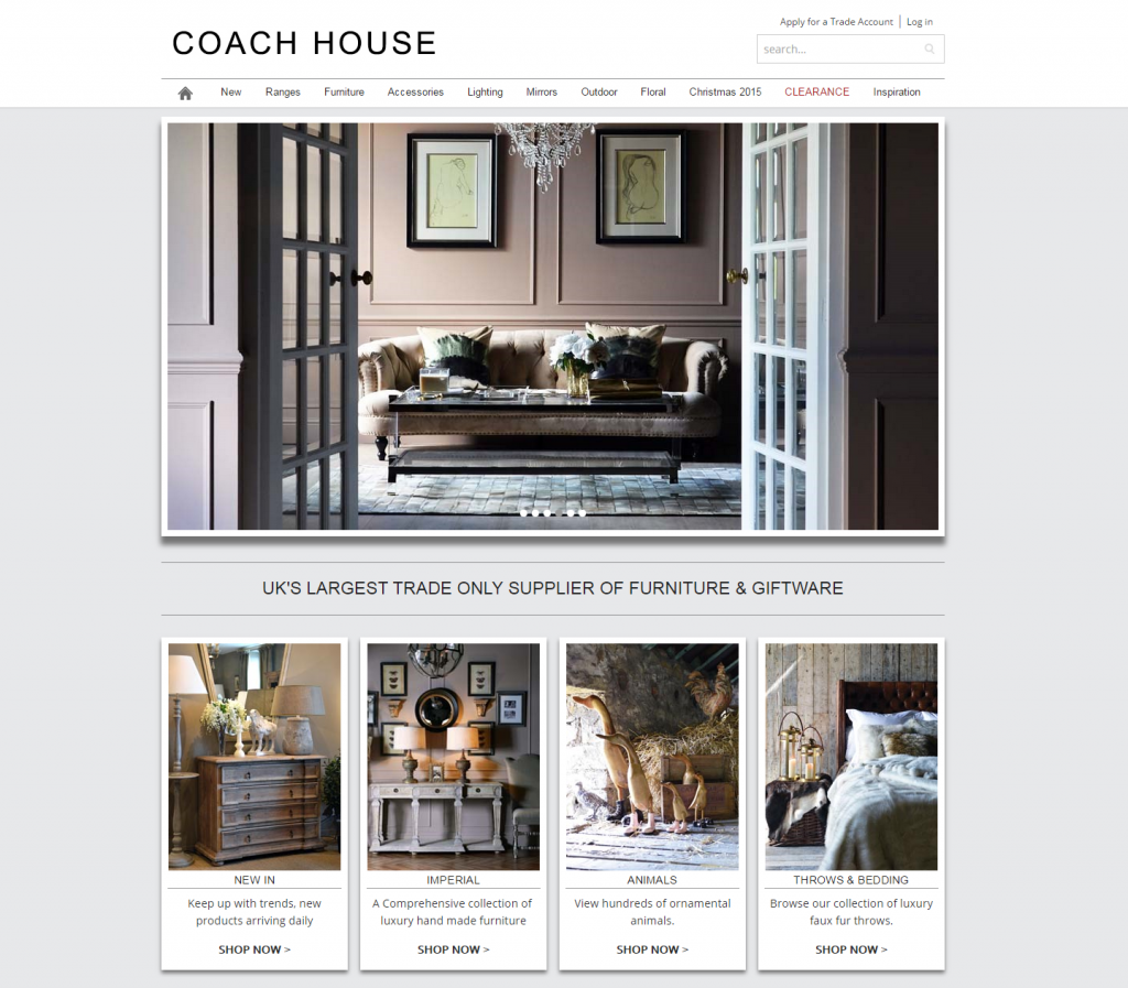
Coach House – coachhouse.com

Coach House is the largest trade-only furniture and giftware supplier in the UK, with over 14,000 product lines. Its offers products which include everything from contemporary and traditional furniture, to design-led accessories – which means the web design is absolutely critical to the business.
Xanthos built the Coach House website to match the look and feel of their high position in the market – allowing for an efficient yet elegant ecommerce system for trade customers to order online.
The mega menu allows for a clear, fast, and simple form of navigation throughout the site, to get to desired categories or products as quickly as possible. With a mobile responsive design, shopping on mobiles and tablet devices remains seamless.

With the help of the website built by the team here at Xanthos, Coach House achieved a 36% increase in online sales in just two months after the launch of the site.
Jewson – jewson.co.uk
Jewson’s website doesn’t look the fanciest or most modern, but it’s certainly functional and clear. And for B2B, that is often the most important part.

The prominent slider displays some of the most important offers or products, whilst the overall corporate branding and colour scheme remain an important part of what makes this website different.
The search feature is also prominent, allowing for customers to search via product code – often a very appreciated feature for B2B customers.
The mega menu is very functional and allows for quick navigation – and the wishlist is also a useful inclusion on the site.
Including social links is a great way to keep customer retention strong, and the overall image-based design works very well.
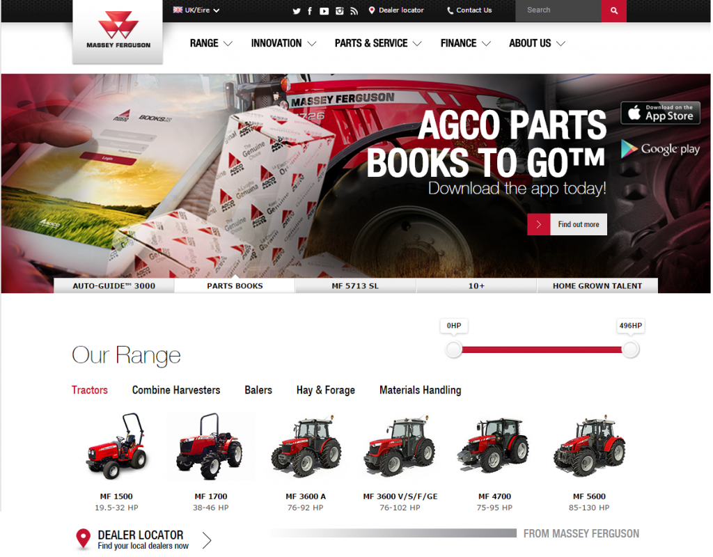
Massey Ferguson – masseyferguson.co.uk

Massey Ferguson has achieved a very nice website design which presents every necessary feature in a clear and orderly format.
Sporting great presentation of the categories and products, the dealer locator is also prominent, allowing for an efficient user experience, that also gets customers to the right place fast. The product pages remain clean and clear, with no unnecessary features bloating the experience.
Colour and branding plays an important part of forming a unique identity for the website, which matches the appeal of the products.
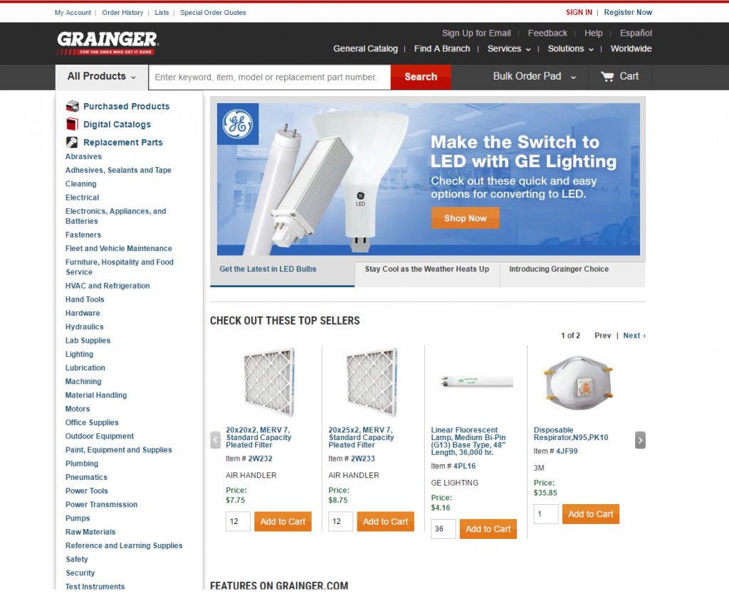
Grainger – grainger.com

Grainger has long been an effective B2B website, albeit American, yet the formula clearly works. The navigation is easy, with quick access to specific categories and product list.
The search is clear and really grabs your attention, allowing customers to search via manufacturer model number, item number, cross-reference number, or other keywords and brands.
Product availability is also made clear, and encourages customers to purchase before it’s too late. Ordering is easy and succinct, and an added bonus is there is no compulsory registration – which is often not used in a B2B environment. This ensures that there are fewer cart abandonments, as people may not wish to register.
As these examples show, the B2B ecommerce sector has key elements that need to be incorporated into the web design. However, that doesn’t necessarily have to be done in exactly the same fashion – allowing for differentiation in competitive markets, and allowing them to stand-out from the crowd.
If you’re looking to build or upgrade your B2B ecommerce website, get in touch with the team here today, and we would be thrilled to discuss how we can help you succeed online.


