Another year passes, and 2016 is here, bringing another host of web design trends that will prove popular over the coming months.
2015 saw mobile traffic overtake the desktop, and Google deemed mobile-friendliness as a ranking factor for SEO. Technology at hand and how the public use their devices are shaping the web at large, and so websites have to adapt accordingly.
So what can we expect, and how can your brand stay up-to-date?
Originality
For a start, a trend will be that more websites will incorporate original elements, specific to their brand or message.
For instance, websites are increasingly using animations, hand-drawn images, or creating original experiences with HTML5. This is a more away from generic websites and predictable patterns, and giving customers a more personal and unique website to browse.
In the past few years, there has been a growing trend of “web design homogenisation” – whereby many websites are beginning to get a bit too similar, due to too many web designers following the latest, hottest trend. And this also means not standing out in a very competitive online landscape.
Whilst moving forward with design and staying up-to-date is important, it can often prove fruitless when not done properly. Many brands and designers are becoming more focused on being “on-trend” than innovating, and actually driving conversions with a top-performing website. At the end of the day, results are what a website is all about. And a great web design can achieve this.
With more generic themes available comes more generic websites on the web – with many of them following the exact same trends. But 2016 is surely the time for brands to realise they can stand out of the crowd with a bespoke design that is tailored to what they are trying to achieve as a business.
User experience
Remembering that originality and creating a unique experience is going to be an important trend, this will mean more designers will focus on user experience rather than design for the sake of looking nice.
Creating a compelling and results-driven user experience will have a rejuvenated and rightful focus. Having an up-to-date and stylish website doesn’t mean anything if it isn’t usable by your target audience, and doesn’t get them to convert or engage with your brand.
Google supports this view, as the fact it encourages businesses to have websites that load fast and are easy to use on different devices is purely to ensure Google users get the user experience they deserve.
Mobile as a first screen
User experiences on mobiles are about to become more important than ever. People now expect a full experience of a website on their phone. No slimmed down versions that miss out key features.
For many people, the mobile is now the device they will first find your website on. And it is increasingly the main device for internet access.
This means that web design is no longer a one size fits all deal – all designs, images, logos, banners, artwork, and any other visual content, needs to respond to the screen it is displayed on, and be displayed in an appropriate manner.
When developing a website, a responsive web design is pretty much a given by now. Yet there’s still a huge number of brands unprepared for customers browsing on mobile devices – so if you haven’t made the switch to responsive yet, then it’s time.
Having a fully-functional mobile-friendly website will be a trend in 2016 simply because it’s a necessity, rather than a “nice-to-have”.

Infinite scroll
Infinite scroll is also set to become more widespread. The ability to scroll infinitely, without the need to skip to a second page, means it’s a lot easier and faster than clicking to load more content, or products.
This keeps users engaged, and gives them a reason to stay on the current page, rather than leave. This is great in order to encourage conversions for shopping, as customers can scroll until they find something they fancy, and also benefits SEO in some ways, as the fact people should spend more time on your page and/or website, will reflect well with Google.
Lazy loading
Lazy loading is also going to be big news throughout 2016. Big names are already using this strategy – such as Facebook and Pinterest gradually loading the latest feed updates without loading icons.
This is especially great for visual brands that present a lot of content – whether it’s images, a blog, or other forms of updates. Loading small chunks at a time can reduce load times, and keep users engaged with the website.
Material and Flat Design
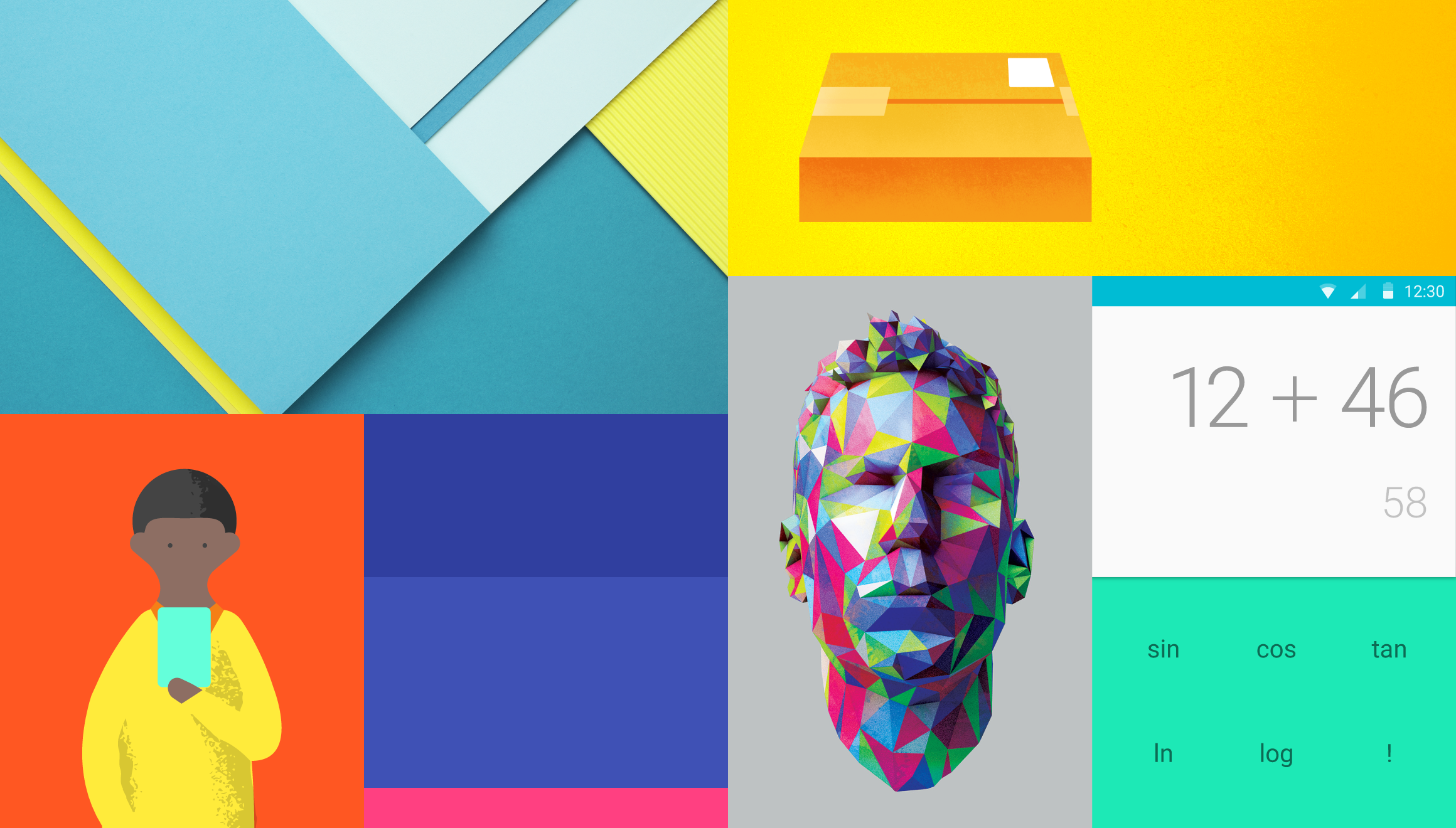
Google has been pushing Material Design for some time now – and many brands have adopted it. But it’s set to become even more popular in 2016.
Material Design came after Flat Design became popular – whereby simplified, minimalistic designs were the popular move. But now Flat 2.0 design is going to emerge, making great use of depth and shadows to highlight different areas of the website.
This is also reflected in logos and other forms of design in branding. Many big brands have already adopted flat logos, evolving from previously bloated designs.
Material and flat designs will also lead into more brands utilising card or tile layouts, whereby content or categories are presents in a grid. This can be useful for web design, as it guides and orients users to the places a designer wants them.

Bold Colours
As far as design goes, colours are often neglected as a way of drawing attention to the right places. Bold, rich colours are also becoming much more widespread.
Of course, using bold colours for the sake of it isn’t the right way to go. But using them as part of the design, with user experience and results in mind, can really enhance the performance of your website.
Bold accent colours can convey messages, enforce values, and draw the eye to the correct parts of the page.
As you can see in a web design created by the team here at Xanthos, the EC Group home page uses bold shades of red and other colours to guide the attention of people on the site.

Design for Storytelling
Web design is also set to get a healthy boost of storytelling involved. As more businesses use videos or other visual aids to prompt brand or customer stories, design has to incorporate these elements.
Whether it’s a central video, infographic, image, or otherwise, designing to create a compelling story is always a great way to show customers what your brand is about.
Designing a website around a central theme or video series can create a great visual storytelling opportunity – where you can share why customers should choose your brand over all the others available online. Videos are highly shareable and keep customers engaged, and if you can come up with the right story to tell, you can highlight the benefits of the brand very effectively.
Minimalism
A trend that’s very nice to see – minimalism and simplicity are slowly but surely winning the war against garishness and websites with too many features and components. As with anything, less is more – and that stands with web design.
Clean and clear designs are leading the industry forwards, and providing better user experiences at the same time. If you have provided a top user experience that conveys your brand messages and encourages the results you seek – then there’s no need to add in fluff or filler to make up the space. The designer’s job is to make this look good.
Ghost buttons are one element of minimalistic designs -whereby only the outline of buttons are shown, keeping a clean, fresh look on the page.
Simple typography is also on the rise. Long gone are the days of overly-complex and fancy fonts. Sticking to simple fonts is the way you ensure visitors to your site can easily and quickly read your content. Internet users don’t have much patience these days. Thankfully, Google Fonts allows everyone access to a wide range of great fonts for free, so it’s easier than ever to stand out from the crowd.
Minimalistic sites also have the added benefit of faster load times – which means you’ll also be on Google’s good side, and hopefully, gain a few rankings for your SEO efforts.
When it comes to responsive designs that work with mobile devices, then it’s essential to work up from the essentials. Deciding what you want on the small screen real estate of an iPhone is important, and then a designer can work up from there to the desktop. This is much more efficient than trying to cram everything that’s on a desktop website onto a screen that fits in your hand.
As you can see from the design below from the team here at Xanthos, a minimalistic and clean design works very well for the Coach House brand, and looks great on everything from a mobile phone to a desktop PC screen.
Carousels
Carousels have long been a big part of web design, but more and more brands are making use of hero images with great results. You can see one on the Coach House site above, showcasing the great products they offer, and what can be achieved with those products.
Overall, banners and home page images are getting larger – which allows brands to capture the attention of target audiences in an instant. Often, these take up the whole of the homepage, which can work very well on tablet and mobile devices especially.
Through developments in data compression, large images no longer slow down a website. Visual interest can really help encourage a user to explore the website, and give them a sense of what you have to offer, and what the brand is all about.
If used well, it allows for less clutter. As long as content below the fold is not affected, then it can be a really good way to attract customers. However, making sure this content is found is all down to a good quality web design.
Cinemagraphs
If you thought still images weren’t enough, then perhaps you’ll be pleased to see more cinemagraphs gracing the web in 2016.
Cinemagraphs are moving images, such as GIFs, that express more emotions or words than a similar still image.
Rather than using a video, cinemagraphs also boast the benefit of using less bandwidth – meaning faster load times, and less taxing on the data end for the user.

Animations
Animations for user interactions on websites are also popular now – such as spinners on loading screens.
Animations when a user hovers over a particular link, image, or piece of content can help create an intuitive feeling, adding to the overall user experience. This form of design can really help engage a customer with what is on the screen, and encourage clicks and conversions where you want them.
What trends to implement?
If you’re reading your list, and deciding what you need to implement in your next website update or new design, then this all depends on a number of factors.
It depends on your brand, and how certain elements can be used to convey your specific message. It also depends on how much you wish to overhaul your design.
If you’re looking to update your brand image, and get a headstart on the competition online, then it’s often best for a complete redesign, and ensure your website is designed with your audience in mind, and provide the best possible experience for your loyal customers.
It’s essential you serve your existing and potential customers, and reinforce what your brand has to offer, before implementing features that are there to simply “look cool” or appear fancy.
If you’re looking to bring your brand up-to-date, why not get in touch with the team here at Xanthos? We’ll be more than happy to discuss what you’re trying to achieve online, and how we can help make it a reality.


